Latest Updates

A Gothenburg home in monochrome and brass /copper

Morning! I've been umming and ahhing about whether or not to feature this home as it's been published across the blogosphere at an alarming rate. But then I thought, what happens if you miss it?!! Everyone needs to see this home with it's black, white, brass and copper colour scheme and everything else on trend in the Scandinavian interior design world right now. So here it is, a monochrome Gothenburg pad in all it's glory, up for grabs through Stadshem. Who's on the case?!


Stadshem via La Maison D'Anna G

What do you love most about this home?

If you're into the copper trend here are a few other spaces you might feel inspired by: a minimalist apartment in Berlin, inspiration from Bloomingville and the beautiful apartment of a Swedish designer. I do love a touch of copper right now.

Tonight I'm very sad to be missing the launch party for new book Design Bloggers At Home. Luckily my lovely parents will be attending on my behalf - and I've asked them to saya big hello to the author Ellie Tennant, photographer Rachel Whiting, publishers Ryland, Peters & Small and all the talented bloggers who also appeared in the book! I hope you have a great night, sorry to be missing it.

Have a lovely day and see you tomorrow!

What I would do differently

Hello! First of all, I know some of you are having issues getting emails with posts from blogger’s feeds lately. From what I’ve read it’s an issue with Yahoo emails – they seem to be going to spam? So if you have Yahoo be sure to check that. Also, the feeds are still working, it’s the email that’s not. So if you want to get all the posts from your favorite bloggers, I suggest you subscribe to them all in one spot like Bloglovin. I used to bookmark all my blogs on my computer and now I love having them all in one place!

So last week I talked about the process of building our house ten years ago. Today I’m talking about what I would done differently when it comes to the finishes and upgrades and layout – all that good stuff.

First up – the things I love about our house! Well, there’s a lot more than this that I love, but these are certainly things I’m glad we did. One was upgrading the elevation, or the front of the house:

cottage shutters on house

I fell in love with those shutters and the design, and when I saw this brick I was sold. I LOVE our brick. It’s just on the front – I wish we would have wrapped at least the bottom half of the house all the way around. Brick holds up better and feels safer to me.

I’m so glad we put in a basement – we got about $12K in free upgrades and used that towards the basement. If you have kids I don’t think it’s ever a bad idea if you have the option and the funds. If you don’t it’s still much needed storage, even unfinished.

I’m also glad we roughed in a bathroom down there:

blue and green bathroom

Even if you won’t finish it off a potential buyer might. And adding plumbing after the fact is not cheap! The bottom line is, the way you live in your home changes so much through the years – space you don’t use early on may be space you are craving years down the road. And rooms you use a lot early on may not be needed as much later (a playroom for example).

We fell in love with this house because it was so open and there are good and bad aspects to that for sure. It’s not for everybody. Sound does carry. :) I was worried our heating and cooling bills would be awful but surprisingly we don’t pay any more than friends with less open houses. Well, maybe a little more in the summer, but the winter is fine.

If could do it again I would do the cathedral ceilings and open floor plan again – maybe just not quite as much in the house. Our foyer, living room, staircase, loft, bedroom and master bathroom all have the high ceilings:

craft room table

I especially love it in the foyer, staircase and bedroom. Most of those came standard with our house plan. We stuck with the basic eight foot ceilings upstairs otherwise. (And as a side note, I’m so happy we did nine foot ceilings on the main floor!)

Here’s one I wish we had done more of – recessed lights! I love them and wish we would have put them everywhere:
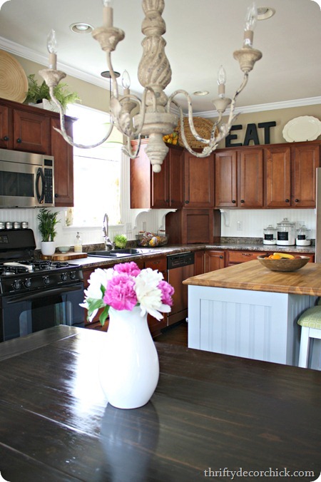
beadboard backsplash We have them in the kitchen and over the fireplaces (and we installed them in the basement later) and I wish I would have placed them strategically all throughout the house. But I’m weird and I love a lot of light, especially in the winter.

OK. Now, the stuff I would have done differently! Some of it’s big, some small. A biggie is the thorn in my side – the corner fireplace:

corner fireplace

I was all, “Oh, it will be COOL and DIFFERENT!” and it’s just ANNOYING and AWKWARD. I’ve made it work over the years but I’d still rather have it on a flat wall. Normal is good, trust me.

Here’s a small one – lights in the closets. All the closets! Linen, bathroom, storage: organized linen closet
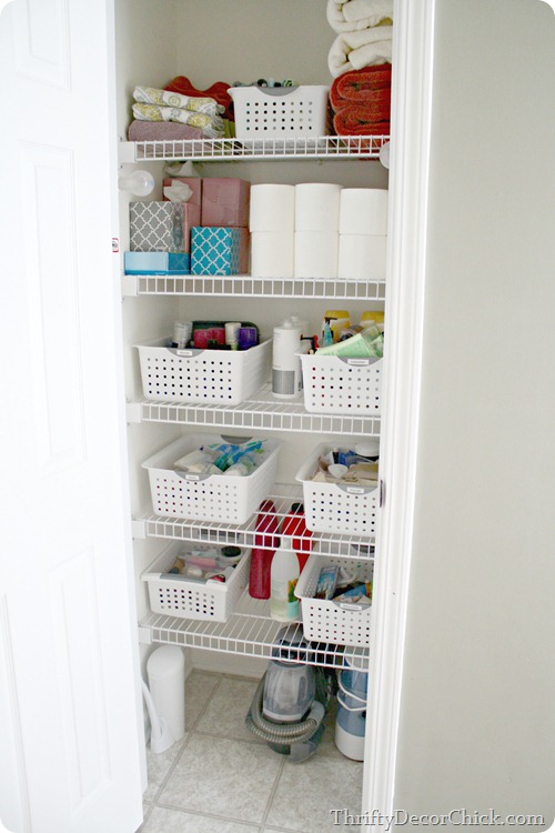
Whatever it is. Put a light in it. Just do it.

Also, I’d have a light fixture installed in every room. We don’t have ceiling fixtures in two bedrooms, my office and the living room and I so wish we had them: red blue boys room
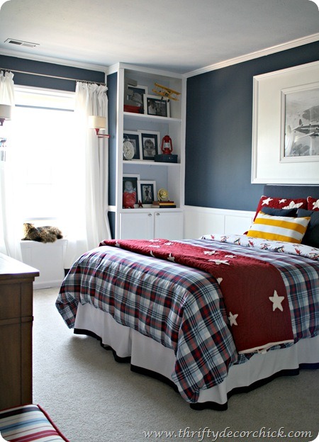
If anything have them roughed in and you can hang something you love later.

Our builder did connect light switches in each one of those rooms to an outlet, so we have lamps plugged into those. It’s convenient to walk in and flip a switch for light.

This next one is a biggie and it’s two-fold. Most homes you walk from the garage to the mud room/laundry to the kitchen, right? Ours is weird. We walk from the mud room, past the office, into the family room and then into the kitchen. I seriously sit and think of all of my friend's houses and ours is the only one I know of with that layout. It’s not ideal – especially when you’re bringing in load after load of groceries.

Another big thing is I would NEVER put my HVAC system so close to the family room again:
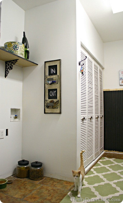
(Old pic of the mud room but it shows the utility closet.)

You don’t realize how loud it runs until you’re trying to watch TV. :) I love days when I don’t have to run it just because it’s so QUIET in our family room and kitchen. I would move it to the garage or a storage room in the basement in a heartbeat.

And I think it goes without saying if you’ve read this blog for a while – I would never have put the washer and dryer in this room again. Ever. It didn’t work for us. I would put it upstairs (in a tiled/waterproofed room) or in the basement. Or just away from the garage door where you dump all your stuff. :)

Both my husband and I agree – the biggest thing we would have changed would have been to bump out the back of the house, even a few feet. Not the entire house, just the family room and kitchen:

DIY farmhouse table

We added the bay window and I’m so glad we did! Otherwise we wouldn’t have much room to move by the table and pantry at all. We are actually thinking about adding more space back there someday but I don’t know if it will happen. It’s just something to think about – where you want more space to live. We have rooms like our dining room and loft that we hardly use and I hate that. I wish we had that space in the areas we use, like the kitchen.

Of course that one especially was realized as we lived in the house longer and longer. It was not something we even considered when looking at models and floor plans. And in general the way we all live has changed over the years – people don’t use formal spaces like they used to. It’s all about your family needs!

So that’s just an idea of what I would do again and I wish I would have done differently. All in all I’m pretty darn happy with what we ended up with. :)

Do you have any thoughts to add to this list? Lights in closets – am I right?? Yes.

A stunning Italian loft

I'm so over excited about today's home tour: an incredible Italian loft created by architects Amorfo. It's a little like a museum - every piece has been carefully selected for it's aesthetics whether mid-century, industrial or designer - and exhibited against a backdrop of concrete / white walls and floors and angled ceilings. Modern day architecture and minimalism at it's best! I would add soft textiles such as colourful rugs, throws and cushions to make it my home. How about you?


Amorfo via April and May

Is this your kind of style? Anything that stands out to you in particular? I love the huge glass door which opens the entire space out onto the terrace!

You can see more pictures of this space here if you'd like. 

I spy: the Flos 265 wall light, the Vitra Wire Chair DKR-5 is similar and one of my favoruite outdoor pieces - the Butterfly chair. Beautiful mid-century pieces like this teak side-table at LiveAuctioneers.

Have a lovely day!

Living room refresh

Good Monday to you! Hope you had a great weekend!

I’ve mentioned before that I LOVE when I get to move furniture around…because I never move it around. Our house has a very open floor plan and very little useable wall space (that isn’t covered by windows). So once I find a spot for something it stays…forever. Moving furniture is a rare treat. :)

I found this étagère at HomeGoods a couple years back and it was love at first sight. I loved the detail on the sides of it and the size – nice and skinny. It started out between the two windows in the living room, but that became too busy to me, so I moved it next to the sofa last year:

tall etagere

It was there for a long time, but the height right there bugged me. It was right where the dining and living rooms meet and it felt awkward. I don’t have a full shot to show what I mean. It wasn’t awful or anything, I just wasn’t feeling it.

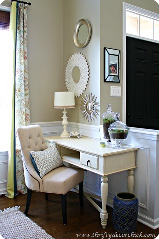
I decided a few weeks ago to try it in the corner where this desk/console used to sit:

desk by window

I wanted to use that desk in my office so the spot was freed up. I moved the bookcase over and loved it in that spot! And that of course started off a series of other small projects as well. It’s how I do. :)

When I installed the new window trim a couple weeks ago I started replacing the chair rail as well. I wanted something simpler that would sit flush against the window trim. And when I put the rail in years back I kind of cheated along that half wall behind the desk. Long story short the trim on the half wall didn’t meet up with the chair rail on the wall. So I removed all of it, including the top of the half wall, and installed all new:

replacing trim on half wall

Now the chair rail on that wall is one continuous piece of wood instead of two mismatched pieces. This would all make more sense if I had taken a before pic, but I forgot. :)

I got this new-to-me primer at Lowe’s when I was painting the window trim and so far I love it:

wood primer

It gives the wood a great base and goes on really smooth. I finished off the new chair rail and the top of the half wall with caulk and two coats of semi gloss paint. I still have quite a bit of chair rail to replace but I’ll do that as the budget allows.

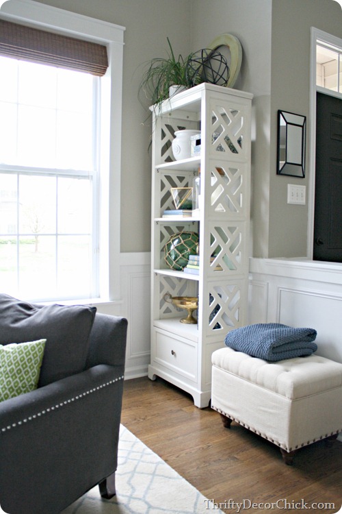
But the best part is that I think this piece has finally found it’s forever home!:

skinny bookcase

It’s much bigger than the desk was, but takes up less visual space for sure. I couldn't believe the difference. I love how open it feels now and that we can appreciate the pretty detail on the side!

I loved what I had on the wall above the desk so I moved that between the windows:

DIY craftsman window trim

I’m not sure that will stay but I do like that the round mirrors break up all the rectangles in this spot – windows, wainscoting, bench and bookshelf.

OH! And I pulled the chair away from between the windows and I LOVE it. I hesitated to put the chairs on the rug (they don’t match but I’m working on that) -- I’ve liked having the floor more open. But WOW, what a difference it made to pull everything together – it really opens up this room. Love it. More pics soon!

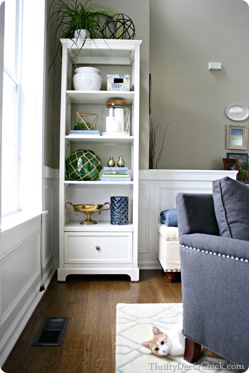
I edited the contents of the shelves down a bit:

white etagere

I’m not 100 percent on the bottom shelf, but I’m using what I have so I’ll deal. ;)

I’ve decided for now I’m not putting the drapes back up. I’m sure I’ll crave more color there eventually, but for now I’m loving how clean and simple it is. Speaking of color, I was looking back at photos and found this before that shows the étagère in it’s original spot and the old pinky walls:

bookcase between windows

Can you believe how pink they were in that light? Goodness. Anyway, here’s how it looks now, with new paint and trim: craftsman trim on windows My little BFF is smooshing himself into this shot. :)

This room was on my list of spaces I wanted to rework this year and so far I’m really, really happy with how it’s coming together! It’s a two story space so it’s harder for me to figure out.

Do you move furniture around a lot? If so I’m jealous. It’s a free fix when you get the itch to tweak things around the house. :) Or do you keep things the way they are forever like me? I love using what you already have in a different space – it feels brand new when you move it around!

A light and airy white and grey Swedish apartment

Hello Monday! How was your weekend? I thought I'd kick off the week with something light, bright and airy. A classic white and grey Swedish apartment with light wood floors and white walls owned and styled by Hanna Malmberg. I could kick around here this lovely sunny Monday morning, how about you?


Styled by Hanna MalmbergStadshem via Coco Lapine Design

So beautifully styled by Stadshem for the sale don't you think?

I am seeing the Muuto Dots Hanger everywhere right now. Here, they've used the small and medium natural oak version to add interest to a wall in the bedroom.

I love the white floor in the kitchen (practical though?). I was in my neighbour's home over the weekend (it's like something out of Birds of a Feather in my neighbourhood!) and noticed she'd painted her wood floor white over Easter. The floor was a tightly joined smooth oak finish before so I wasn't sure how it was going to turn out - but it looks incredible! I'm wondering if I should paint my bedroom floor white now, what do you think?

Other beautiful white and grey spaces include the home of By Nord owners, the fantastic home of a creative Finnish duo and a wonderful Danish home.

Have a lovely day!

Checking out Laura and Erin!

Hello everybody! It’s a dark, rainy morning here and I’m loving it! I love (occasional) days like this – it’s so dark and cozy in the house.

Today I’m showing off a couple of extremely talented ladies, this time fellow Hoosiers -- whoot WHOOT! I found their blog last year and have been catching up on posts since. I don’t know about you, but finding a DIY/decor blog with tons of great ideas and eye candy totally makes my day. It’s even better than a magazine. (So you know that’s good!)

Laura and Erin at House Envy are sisters who blog together. Awww! And they obviously got a decorating trait passed down from someone because their homes are gorgeous.

First up, Laura’s kitchen. Totally LOVE IT:

gray kitchen cabinets

That island – it goes on for days, with the stone and the trim work and the storage. And that bench? What? Dying!

And Erin…she’s a girl after my own heart. Just look at her black door:

interior black door and trim

Did you notice she painted the door trim black too? I’ve always wondered how it would look and I LOVE it.

And the craftsman trim everywhere is right up my alley – check out the windows:

gallery wall over desk

You can read more about her move over to the black trim and this office space here.

Another Laura space -- her mud room is the stuff of dreams:

built ins mud room

I mean, really. Love the rust color paired with the blue in the rug too.

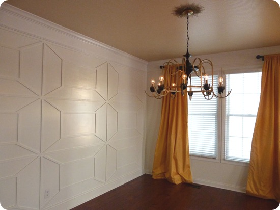
And check out the amazing wall treatment in her dining room:

Her ceiling is wallpapered in there too and it looks SO good.

Erin did a graphic wall treatment as well, but hers was done with painter’s tape:

black and white wall graphic

It’s only above the molding on most of the walls and I love how it looks against the white trim. The colorful print on the chair is the perfect accent.

Both ladies do some fun stuff in the kid spaces as well. Laura used vintage crates for her son’s headboard:

vintage crates on wall

They didn’t even have to do anything to them – just hang!

And I adore the colors in this room Erin made over for her son:

two tone wall

Both have such a great eye – see what just painting the walls two colors can do? No trim needed, just some painter’s tape!

See? Tons of eye candy! I hope you didn’t have much to do today cause you’ll be browsing all day. :) Hope you all have a lovely weekend!


P.S. I have the Pin It button installed on my photos but I ask that you visit their site to pin these projects.

Fabulous spaces by Johanna Pilfalk

Today I wanted to share some of the recent work one of my favourite Swedish interior stylists - Johanna Pilfalk. I absolutely love her style (see more of her projects here) and of course how she always works with fabulous spaces. The first three shots are from the same dining space (what a room?!) which featured on the recent front cover of Plaza Interiör. Undeniably delicious and a perfect way to end the week don't you think?!


All interior styling by Johanna Pilfack (shared with kind permission). Pictures 1, 2 and 3: Photography: Sara Landstedt for Plaza Interiör 5. Photography: Sara Landstedt for Aspen Bad

Anything you love in particular about these spaces?

There are just so many pieces in each image. I spy the Thonet 209 chairs (15% discount with 
code MYSCAN), Loft Zig Zag floor lamp, Muuto dot hanger, and Tom Dixon etch tea light holder

Interior stylists naturally nearly always have fantastic homes. Some of my favourite home tours include the Stockholm apartment of Sasa Antic and the eclectic Borås home of Johanna Flyckt Gashi. I could move in to either of them tomorrow, how about you?!

I hope you have some great plans for the weekend? It's going to be hot, hot, hot here in Southern Sweden. Actually that's an exaggeration, it's going to be 15 degrees. But hey, I'll be out enjoying it like it's the height of summer!  

Have a wonderful weekend and see you Monday!