Latest Updates

October, home tour and projects

Hello and happy Halloween! I hope your forecast is better than ours! We’ll be heading out after school to get the kiddo some new long underwear for this evening. It may be a quick trip around the neighborhood tonight! :)

Thank you SO much for the love on our family room, not only here but on Instagram and Facebook as well. I truly, truly appreciate when you take the time to comment – it doesn’t go unnoticed!

At the end of of each month I like to recap some of my favorite posts – it’s a nice way to see what I’ve accomplished and catch you up if you missed a post. I’m definitely planning to slow my roll a bit for the rest of the year -- November and December are going to be unusually busy for us. So I’m looking forward slowing down the projects…cleaning and decluttering my house and decorating for the holidays sounds amazing! I can’t not do DIY, I love it, so I’ll still be working on things here and there of course.

Before I go into the recap I wanted to share that I’ve updated the “Our Home” page – some of the photos were a bit dated and I rearranged some things too. I’ve also added a Projects tab at the top of the site that includes some of my favorite decor, projects, tips and recipes over the years. I try to update that at least every couple of weeks so there’s always new sections and links popping up.

OK – to start the month I addressed the naked windows in the dining room/library. They had shades but no drapes so I took care of that:

wall of built ins

The drapes were from our living room windows and they look SO much better in here. I still can’t believe how much warmer it feels in there – it’s a little thing but it made a big difference. I have some more updates of that room to share soon!

Next up I shared the ways I decorate our walls/fill them without using art:

wood planked wall stained

That planked wall cost me less than $50 and it’s one of my favorite projects ever! I’m all about easy ways to add character to our home and this does it.

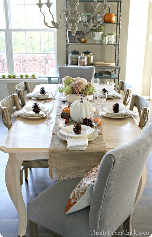
I’m so excited about the potential for our kitchen and thrilled with the table and it’s new spot. I had fun decorating it for a fall table setting:

simple fall table setting

Can’t wait to show you that same space with the new doors and board and batten on the walls! I think it’s going to look so good!

I did a little fall nesting throughout the rest of the house as well and warmed up the bedroom fireplace a bit:

green walls fireplace

That fireplace is one of the many things I fought my husband on hard when we built this house – and it’s now one of the many things that I now thank him for. ;)

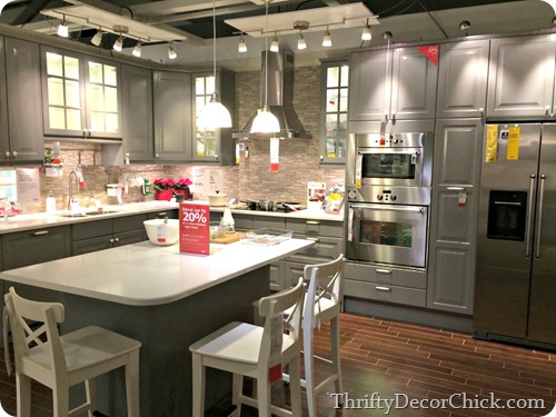
The Bub and I took a trip to Cincinnati for a fun day and my part of the fun was IKEA. I shared a few of my favorites from the trip (including some Christmas decor):

ikea kitchen

This is my favorite kitchen at that IKEA. I walk through it every single time. :)

I finished up the new trim and paint on four doors in and near the family room and I LOVE it, as always:

thick door trim

Many of you asked about the signs on our bathroom door (I love them!!) and I link to where I got those in the comments of that post:

thick craftsman door trimBlack and white will always be a classic!

It has been an absolutely glorious fall this year – I shared our day trip to beautiful Brown County Indiana:

fall in Indiana

There’s still a few leaves hanging on – but the potential snow predicted this evening (!!) make take most of them.

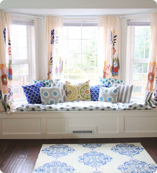
One of my dream projects for our house has always been a window seat – and I’m finally going to get one. :) :) So excited. I shared my inspiration for what I’d like to do in this post:

bay window window seat

(source)

If you follow along on Instagram or FB I’ve shared/will be sharing some more pics along the way. I’m really tired of painting but I may tackle the new window trim in that spot this weekend.

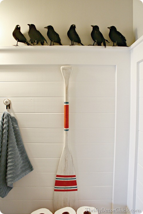
We only put Halloween decor out for a week or so inside the house and I shared how we do it quick and cheap here:

cheap Halloween decor

You’ll have to go to that post to see the surprise under the crows. ;)

One of the last projects I finished up in the family room was an old Craigslist dresser I painted:

black dresser brass hardware

I absolutely LOVE it in this deep gray color. By the way, I’ve been saying that paint color (Graphite) is Sherwin Williams and it’s not – duh! It’s Benjamin Moore but I had it mixed at SW. Sorry about that. :)

And of course, the full family room reveal happened earlier this week – finally. Goodness, we are SO happy with it!:

family room with board and battenI’ll be sharing more details about the space next week!

Have a safe Halloween and a lovely weekend!! See you Monday!

A fab Amsterdam apartment

This is my second dutch home tour of the week (see the other one here). I really do love the Dutch style. It's incredibly similar to Swedish decor with the white floors and walls, but the Dutch tend to go for more bright pops of colour. This home, spotted over at wonderful blog French By Design, in the heart of Amsterdam belongs to interior designer / stylist Brechtje Troost. It follows the general Dutch design rule with the white backdrop and bursts of colour but it also features a fab mid-century twist. And wait - I even spot a Swedish print! An apartment truly deserved of the coveted Friday my scandinavian home tour spot, don't you think?!

Photography Jantien De BoodInside Out Magazine via French By Design

Photography Jantien De Bood. Styling Josefin Ljungberg & Brechtje TroostInside Out Magazine via French By Design
Photography Jantien De BoodInside Out Magazine via French By Design

Photography Jantien De BoodInside Out Magazine via French By Design
Photography Jantien De Bood. Styling Josefin Ljungberg & Brechtje TroostInside Out Magazine via French By Design
Photography Jantien De Bood. Styling Josefin Ljungberg & Brechtje TroostInside Out Magazine via French By Design

I love this apartment,  it's very cool don't you think?

For classic mid-century furniture try auction houses Lauritz and Live Auctioneers. I love the cognac tote (similar one here). I'm not sure if it's possible to find a kitty cat as cute as that one though....?

You can read more about this fabulous space Inside Out magazine. 

Do you know what I'm noticing more and more of? Wall to wall carpets! Now, I know that in the UK and the US it's extremely common to have carpets in the home, especially in more cosy rooms such as the bedroom and sitting room. But I was amazed to hear a Swedish friend who is currently planning to add carpets to all the bedrooms in her new home. This is something of a revolution. Could it be one of the big trends for 2015?! 

How do you feel about wall to wall carpets?

Wishing you all a very happy halloween and a great weekend (up to anything fun?).  See you Monday!  

Shades of grey and white in a Stockholm space

Grey really has been the er, hot interior colour this year. Whether it's an entire apartment painted in a striking charcoal grey like this one or light nuances of grey like this one. This apartment designed by Moodhouse follows the latter trend. 'Brohuset' is a new 16 story high glass fronted apartment building overlooking Stockholm (wow!). The apartment has been painted in shades of white and grey and then softened with sheepskin throws and other textiles. I love the half painted grey wall in the hall with the matching chair - definitely an idea to steal! All in all its such a serene space don't you think?


Photography; Kristofer Johnsson. Interior: Moodhouse. Styling Marie Ramse.
Do you like the mix of whites with greys?

I'm not sure where this lovely Stockholm poster is from (anyone know?) but I came across some similar graphic city posters here. My collection of favourite grey items include these napkins. a super soft grey and white blanket, luxury charcoal linen bedding and this 'fading lake lady' painting (don't you think this print would look lovely in this space?!).

More gorgeous grey interiors here, here and here...

I'm so happy to be in London with my girls for a few days visiting family and re-charging my batteries, are you up to anything fun for half-term?

Have a lovely day!
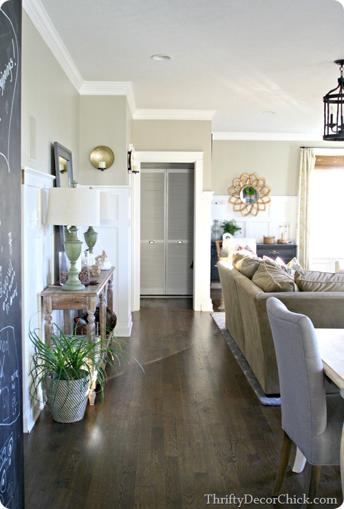
Family room reveal!

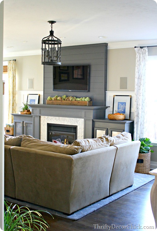
OK. I’m done. I can’t even believe it!! The family room expansion/renovation is DONE. GoodNESS, I worked my butt off on this room! I will go into a bigger background recap later, but long story short is that we wanted to add on to the back of our house, decided against it when we got the quotes (choke) and then decided to knock down a wall instead.

That wall was the one between the family room and my office, the one with the corner fireplace and the wall to the left: corner fireplace

Our original expansion plans were just to move out from that window wall and make the back part of the house more of a sunroom to extend the family room. We were never going to touch that office wall because I really wanted to keep my office. Turns out I don’t even miss, not at all. Isn’t that funny? It was a BEAUTIFUL room but no one ever saw it anyway! Except you guys, ha!

When my mind started working and the thought that taking down this wall might work, I sent this “real life” shot from my phone to two realtor friends to see what they thought. This really shows you a better angle:

The area to the left is our walk way from the mud room and garage and is where we had the TV. We reconfigured the space like this years back and it did help – but I didn’t like the corner fireplace and didn’t like that the room had different focal points.

It’s funny because I look at that photo and we had a much wider space when it was like that. But now, it’s SO MUCH BETTER because the family room is bigger and the kitchen doubled in size as well.

The space is long and skinny – we didn’t get any additional width to the room at all. In fact it’s skinnier now because everything is situated towards the back of the house. But we absolutely positively love it:

dark gray fireplace

From the day we took down the wall we both said – it was supposed to be like this from the start. Actually every single change we’ve made in this whole great room (moving the kitchen table, switching out the doors, all of it) we’ve said the same every time. It should have been like this all along.

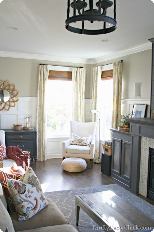
Taking down that wall brought in an insane amount of natural light – we gained two windows from the office. We also added six new overhead lights to the space:

family room renovation @thriftydecorchick

The focal point of the room is now the grand fireplace and built ins:

gray fireplace herringbone tile @thriftydecorchick

We had to built it into the room to accommodate the size of the gas insert – we dealt with that by building out the entire thing and adding storage for electronics and all kinds of other stuff.

I went dramatic and gray with the whole thing and I adore it:

fireplace with built ins I am debating moving the rug down so it’s centered on the fireplace. I like how the sectional sits on it now though – if I move it the sectional will sit half on and half off.

To get an idea of how this renovation opened up the space – the old wall went right down the middle of the new fireplace. Because of the angle of the old fireplace we had about two feet, then windows. There was nowhere else to put furniture but right in front of that double window.

I can’t believe that our family room used to go that far into the kitchen! It actually went almost to the right side of that étagère:

Crazy! The final frontier in this renovation is the double doors that will take the place of that window – it was supposed to happen last week but we had a hiccup. :) More on that soon! (And those drapes will be replaced with some that match the other side of the room soon. These are up for privacy now.)

There are little things we noticed right away when we started this process. First, the animals LOVE IT. They are in this space way more than before. It’s weird. Secondly, we love that there’s one focal point in the space. I used to hate TVs over fireplaces but I’m actually falling in love with the look (and I really disliked it!). There’s no competition for your attention, it’s clean and makes the space feel even bigger. Finally, our view in here is SO much better.

I love love LOVE to sit down on this sofa during the day:

new family room @thriftydecorchick

Everything is oriented to the outside. Before our view from the sofa was the front door and the TV. Now’s all the light and the trees and our pretty deck and patio. I absolutely LOVE that. It’s completely changed how this room feels.

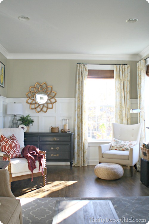
We have more seating in the room now too – the chair to the right is my new “office.” It’s a super cozy spot! The newly painted dresser and the built in to the left of the TV hold my office supplies:

analytical gray sherwin williams

We get so much light in here now it’s hard to get good shots! I’ll take that problem any day. The natural light is why I knew the space could take the darker pieces. I love how they add some drama.

I have a lot of favorite spots in this space and this is one of them. That spool chair was the only furniture purchase for this room and I ADORE it:

board and batten walls

I looked for months for the perfect chair and found it a few weeks ago at HomeGoods. It is spectacular. :)

spool chair

See? Spectacular. And incredibly comfy too!

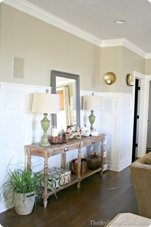
I moved what used to be used as a sofa table to the wall where the TV was before:

world market everett table

Since the sectional is floating in the middle of the room the dresser I had on this wall felt too deep. This table is perfect since it’s nice and skinny.

The big mirror was a happy accident – I leaned it up there to see how it felt and it makes the room feel even brighter – when I’ve taken it down to paint behind it there’s a noticeable difference in the room:

decorating a sofa table

I thought this walkway would feel tight but it’s actually perfect:

walkway behind sofa

Before the walkway was right in front of the TV and again – this just feels “right.” I told you we keep saying that! It’s how it always should have been. :)

And finally, this is my view as I sit and write:

That view will look even better when the kitchen renovation starts…next year…a long time from now…cause Mama needs a break. :)

I still want to share more details and photos of the space, some before and afters and all of the sources as well – I will share those very, very soon!

For now I think I’ll join him:

butter dog

If you have any questions about anything let me know and I’ll be sure to address it!

THANK YOU for coming along for the ride! I don’t think I’ve ever worked harder on a space but not sure I’ve ever been prouder of a space either. :)

A striking family home in Melbourne

Beautiful homes in Melbourne, Australia are popping up left, right and centre right now. But this home, recently featured on the Style Files is extra special as it's been nominated for the 2014 Austalian Design Awards. Designed by Robson Rak in collaboration with Made by Cohen, this Edwardian house in Elwood has been transformed into a contemporary light filled family home.  The look is simple and elegant with a mainly black and white theme throughout and yet the space retains a cosy and relaxed vibe. So lovely!


Robson Rak with Made By Cohen

Wow, what a home! Is it just or me or could you imagine this space ever looking messy?!

The one thing that really stands out to me are the window nooks. Those empty spaces by a window usually taken up by a radiator can in fact be the best places in a house to sip a coffee while looking out over the street / countryside beyond, or to read a magazine in the amazing natural light. I love nooks so much I even started a Pinterest board dedicated to them here! Something else for my home in addition to the yellow we talked about yesterday?!

Anything stand out to you in particular?

I've shown my fair share of beautiful Australian homes on my scandinavian home including the modern look here, bohemian here and vintage inspired here!

You could always take a peek at the many stunning homes featured over at Australin blog Design Files too.

Have a wonderful day!

The bright and happy home of a Dutch blogger

I love a unique home. One where you can immediately tell something about the owner when you walk in (or see the home tour in a post!).  That's why I love the home of Dutch blogger Marlous Snijder (also founder of Oh Marie! magazine),  shot by Holly Marder for her 'Homes with Heart' column on Decor8. This home certainly has heart, and bags of it. I love the pops of colour, the quirky touches, and the slightly bohemian feel. I could hang out here all day drinking tea. How about you?! 


Home Marlous Snijder. Photography: Holly Marder. Decor8


How cute is the 'This morning, with her, having coffee, Johnny Cash' art?! One to get custom made through Geek Chic Prints?!

I think what I love most about this home are the bright bursts of yellow, such a cheerful colour to add to a home don't you think? One day I'll be brave enough to add a pop of yellow to my own home and when I do I'll also be taking my inspiration from this and this home. 

A SMEG fridge always goes down well too...!

Is there anything you love in particular about this home? 

More wonderful Dutch homes here, here and here (in case you missed them!). 

Have a lovely day!