Hello friends and welcome to the (almost) weekend! I’m back today to finish up the homearama tours I first shared with you earlier this week. Have you been waiting? :)
The last two houses were the ones I liked best – the third was my favorite exterior and the last was my favorite design/decor. Let’s take a look shall we? You all said not to skimp on the photos so I’m including more this time. Sit down with your coffee or Pepsi and enjoy!
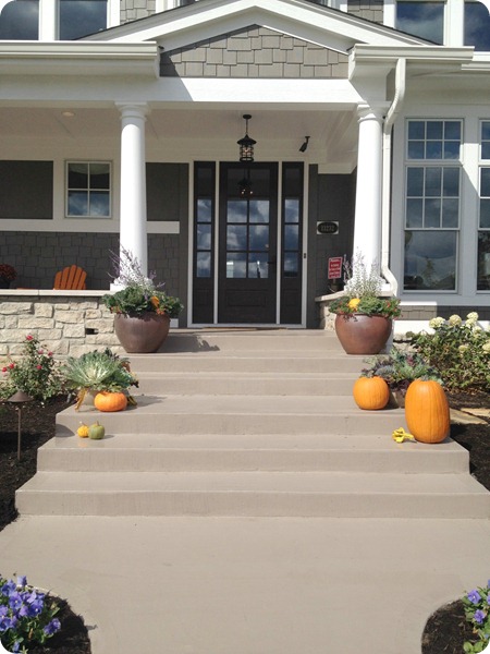
The third home had a huge front porch – I was smitten:
Loved the big wide steps and the glass doors! I’m still trying to get up the guts to do this to ours:
This house had a different layout. You walk in and could go straight to main living area or go off to the side to an office that then continued on to a flex space. That could be used as a guest room I guess, or an in laws suite. There was a full bath connected and then a long hall down from that:
LOVED that hallway with all the windows and the wood trim. Delish.
Off that hallway was the laundry room, which was wayyyy far away from the bedrooms. Not only that but you have to walk through a few rooms and down the hallway to get to it.
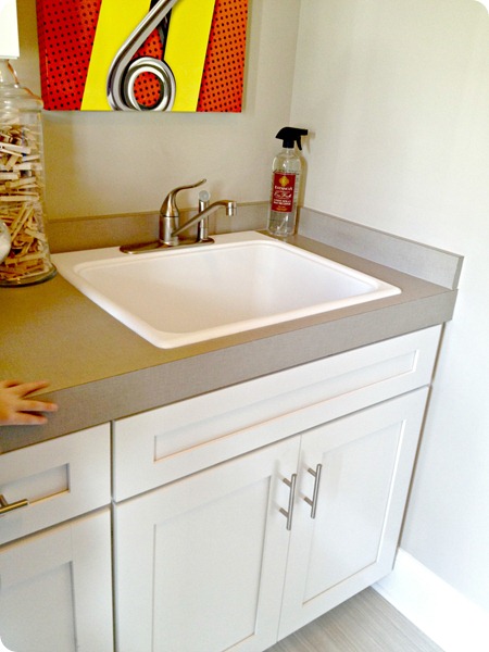
But I did love the countertop they used – it was a laminate (whuuut?):
And it looked like linen. It was actually very cool and pretty in the laundry room:
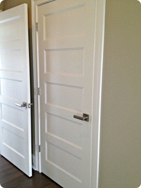
I mentioned before that one of the things you notice about this type of construction are the doors – they are thick and heavy and beautiful:
Down at the end of the hallway you turn and go past some closets and the powder room and enter the family room. I loved this space:
But when you turn around it got very modern:
It’s gorgeous, don’t get me wrong. It just felt out of place in what is a more traditional home. It was just crying out for a big beautiful fireplace with a thick mantel. I guess this is OK too. ;)
The outside area was awesome, I don’t know why I didn’t get a picture! You can see some of it through the family room window above. But I LOVED this idea – it looks like they added another garage door (to the back of the garage) that opened to the patio:
Um, I think that’s brilliant. It would be so easy to put stuff away for the winter, kids could use riding toys and easily put them away – I just thought that was so cool.
Someone asked earlier this week and yes, all the garages were on the backs of these homes, so not visible from the front.
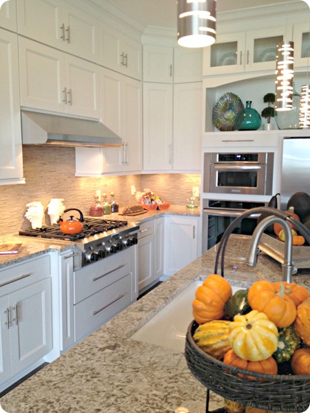
The kitchen was gorgeous:
See how thick that granite is on the island? Big $$$ right there. ;)
I loved that they used the space all the way to the ceiling (I’ve had a plan for years to do the same in our kitchen…someday):
My favorite kitchen was in the first house I showed you earlier this week but I loved the feel of this one too.
The dining room was just open to the kitchen – nothing too formal. Loved the light fixture:
Those bookcases were in more than one of the homes, they must be popular. ;)
The master was a main level one and had a ton of windows and a door to the patio:
A bottom floor master freaks me out and having a door in the room would freak me out even more. I like being up high. :)
The basement was really well done – I loved this bookcase and vignette:

The kitchenette was kind of inset and I loved all of that area too:
I noticed in the basements the decorators really used every bit of space – there was a table in the middle of the room in most of them – spaces I wouldn’t typically put any furniture in.
OK, the last house was my favorite – but the outside was different:
It was very plain and from that view above I didn’t care for it much. But it grew on me when I saw it from the other direction:
The builder was going for a farmhouse “redux” look. The roof is metal and I think that’s the part I didn’t care for. That and the gray siding made it look a little cold to me. But I loved the large stone chimney!
The inside though, I loved! The library was the first thing you saw when you walked in:

The stairs were beautiful with white risers I believe and wood treads, my favorite. ;) Then you turn the corner to the huge great room:
Most of the house was a very farmhouse/industrial look that I LOVED. I don’t know if I’d do it in my house but man, I sure can appreciate it. :)
There were windows everywhere that brightened up the gray cabinets:
The cabinets lifted up (I’ve seen similar ones at IKEA):
Kind of loved that. And I liked how they used an odd space in the corner with open shelving.
Yet again, the only part I didn’t care for was the ultra modern fireplace:

Loved the beams though!:
Another detail I LOVED in this house were the black grids on all the windows:
And this wall of black doors/windows was just stunning:
I couldn’t figure out how to open that door, true story. We later realized it’s a sliding door. Who would've thought?
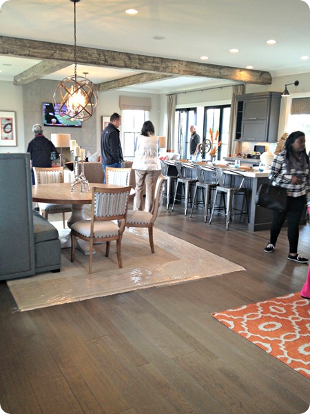
On the way back to the stairs, across from the kitchen was this eating area:
LOVE love love. All of it.
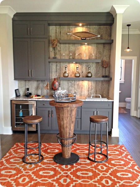
So as you walk to the stairs there was this awesome space:
Again, so cool. Loved the wood wall, the gray, the accessories:
It was a little wine nook. I don’t know how functional it would be for every day, but for a party it would be awesome.
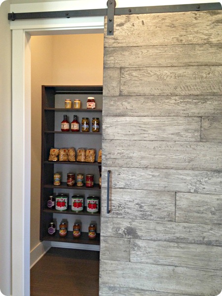
And to the side was a cool sliding door to the pantry:
You see why this was my favorite? Like I said, not exactly my style but so creative and well done.
There was a mud room done in gray as well and it was a little dark:
Sorry for the horrible pic!
I liked this built in charging station idea:
The bedrooms and bathrooms weren’t as exciting to me, but I had to share this subway tile install:
I LOVE that idea of going vertical with them instead horizontal!
The bedroom was lovely, just a bit shiny for my taste:

Is that not the coolest? I know there’s a way to DIY that thing! So cute!
The basement in this house was my favorite too. More of the industrial farmhouse style:
I liked the simple painted brick backsplash:

Sigh. Be still my heart. A room just for the wine. And it had windows so you could look lovingly at it.
Well that’s the tours folks – did you enjoy them? Which of the four was your favorite? As I said, my favorite kitchen was in the first house, favorite exterior was the third one and for interiors the last one for sure.
Hope it was fun to “walk” through with me! Hope you have a great weekend!
The builder for home one was Wedgewood Building Company, decor done by Thomas & Jayne Interior Design.
The builder for the second home was Gradison Design, decor done by Kittles Design Studio.












0 Response to "Home tours, part 2"
Posting Komentar